How to Create a Bullseye Glass Color Palette
for Your Designs Using Photoshop
If you're a glass artist or designer using digital tools, you know how important it is to accurately translate your color choices. Bullseye Glass, known for its stunning, vibrant glass colors, is widely used in glass fusing and kilnforming. Creating a digital color palette for these colors in Photoshop can be an invaluable tool for project planning and design.
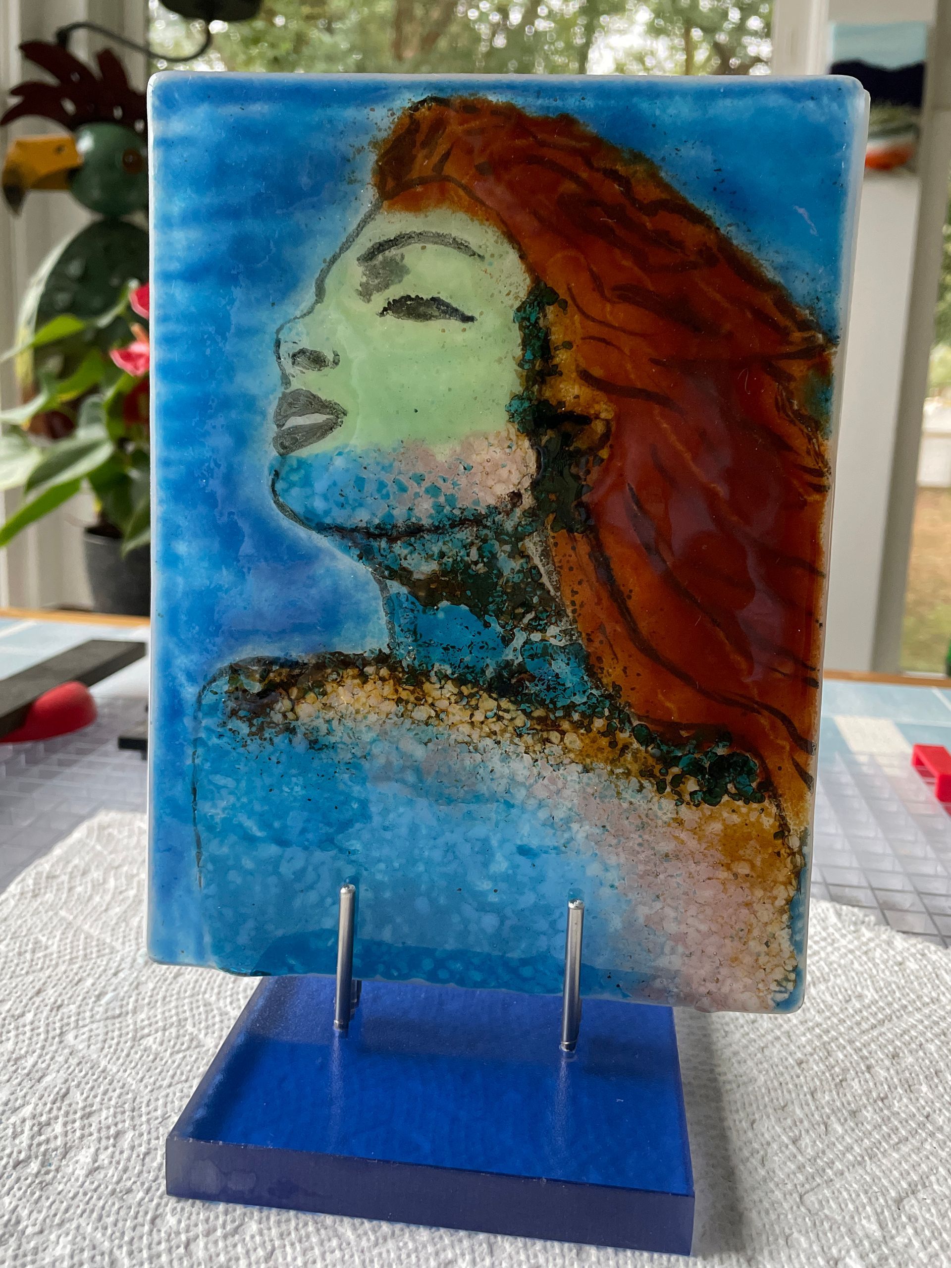
Whether you're designing custom glass art, experimenting with color combinations, or presenting your design to a client, having a Bullseye Glass color palette in Photoshop will help to ensure that your digital designs represent your vision. Working in layers will also help you quickly see different versions of your design. Using a color printout of your design as a reference while creating your glass piece helps ensure detailing and accurate color placement throughout the process.
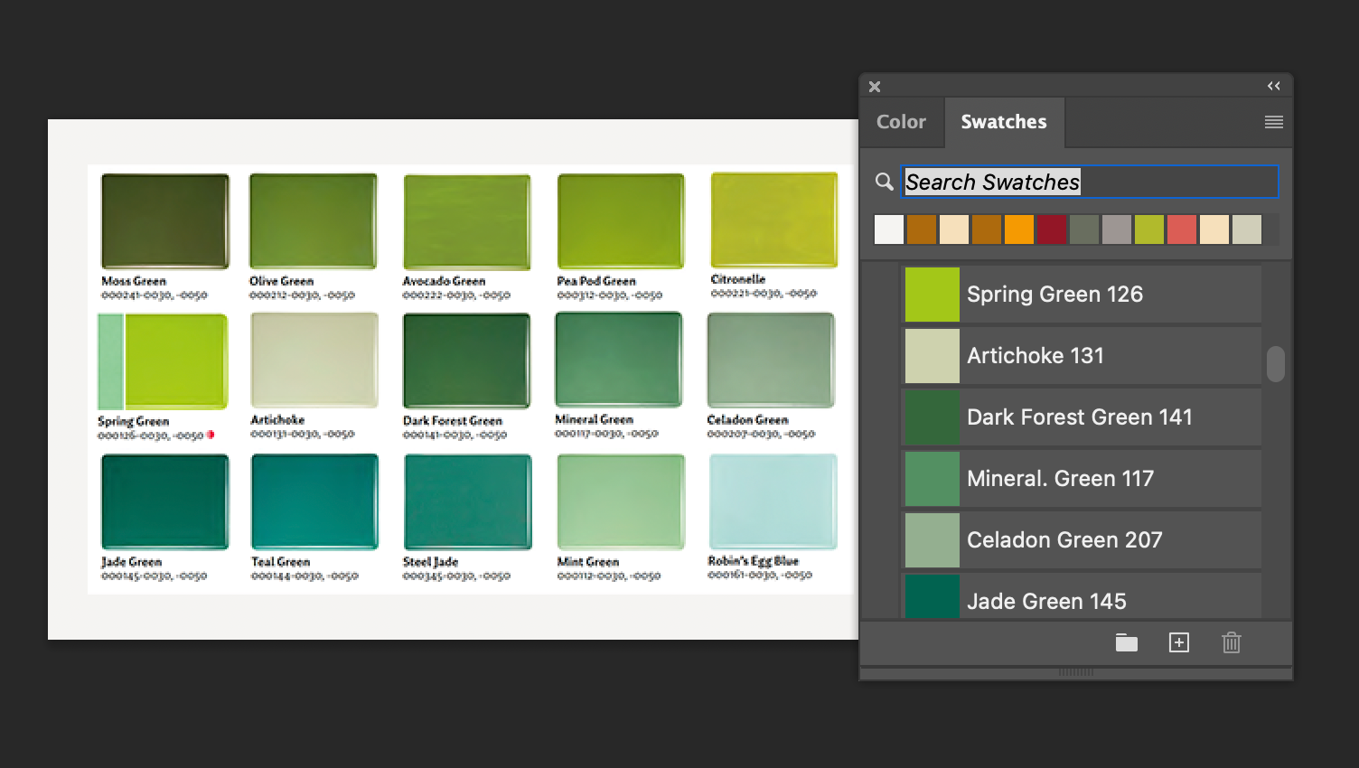
I recently watched a video by Tim Carey, an exceptional glass artist, showing how he designs his glass pieces in Photoshop. A few people asked if there was a palette of Bullseye Glass colors available for Photoshop. No one knew. So, I decided to experiment with creating a palette for BE colors. Not knowing the RGB values of Bullseye Glass, I used a screen capture of thumbnails from their catalog. It included more information (name and number) than working from a thumbnail on their website.
If you're ready to give it a run, you're welcome to download the instructions PDF and the .aco file that can be imported into Photoshop. The instructions will also help you to create a palette for a specific project or palettes for opaque, transparent, etc.
Glass Oasis Articles